Data Wrangling & Visualization
Bernardo Lares
2026-07-01
Source:vignettes/data-wrangling.Rmd
data-wrangling.RmdInstall and Load
Install lares from CRAN or get the development version
from GitHub. Then, load the package:
Frequency Analysis
Basic Frequencies
The freqs() function provides quick frequency tables
with percentages and cumulative values:
# How many survived?
freqs(dft, Survived)
#> # A tibble: 2 × 5
#>   Survived     n     p order  pcum
#>   <lgl>    <int> <dbl> <int> <dbl>
#> 1 FALSE      549  61.6     1  61.6
#> 2 TRUE       342  38.4     2 100
Multi-variable Frequencies
# Survival by passenger class
freqs(dft, Pclass, Survived)
#> # A tibble: 6 × 6
#>   Pclass Survived     n     p order  pcum
#>   <fct>  <lgl>    <int> <dbl> <int> <dbl>
#> 1 3      FALSE      372 41.8      1  41.8
#> 2 1      TRUE       136 15.3      2  57.0
#> 3 3      TRUE       119 13.4      3  70.4
#> 4 2      FALSE       97 10.9      4  81.3
#> 5 2      TRUE        87  9.76     5  91.0
#> 6 1      FALSE       80  8.98     6 100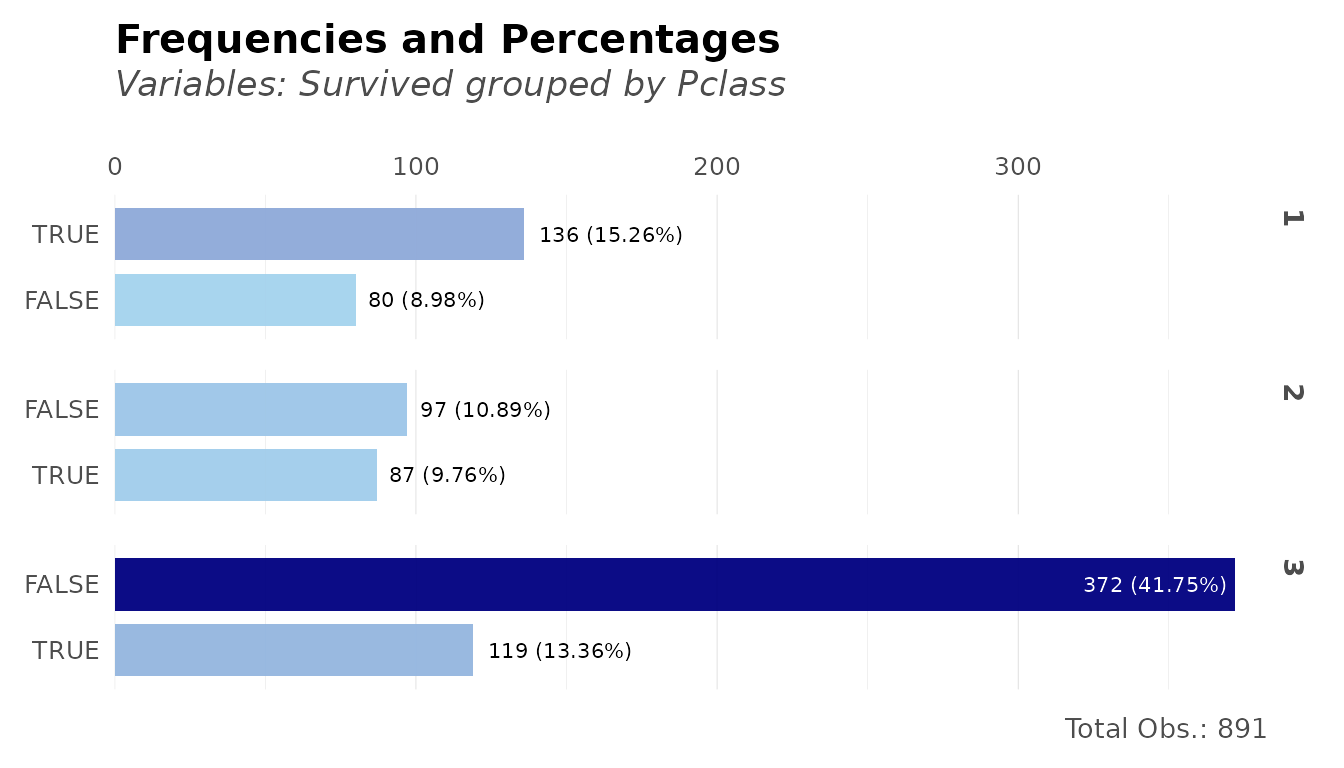
Correlation Analysis
Correlation Matrix
Get correlations between all variables (automatically handles categorical variables):
# Correlation matrix of numeric variables
cors <- corr(dft[, 2:5], method = "pearson")
head(cors, 3)
#>                     Age Survived_TRUE  Sex_male  Pclass_1  Pclass_2  Pclass_3
#> Age            1.000000     -0.077221  0.093254  0.348941  0.006954 -0.312271
#> Survived_TRUE -0.077221      1.000000 -0.543351  0.285904  0.093349 -0.322308
#> Sex_male       0.093254     -0.543351  1.000000 -0.098013 -0.064746  0.137143
Correlate One Variable with All Others
# Which variables correlate most with Survival?
corr_var(dft, Survived, top = 10)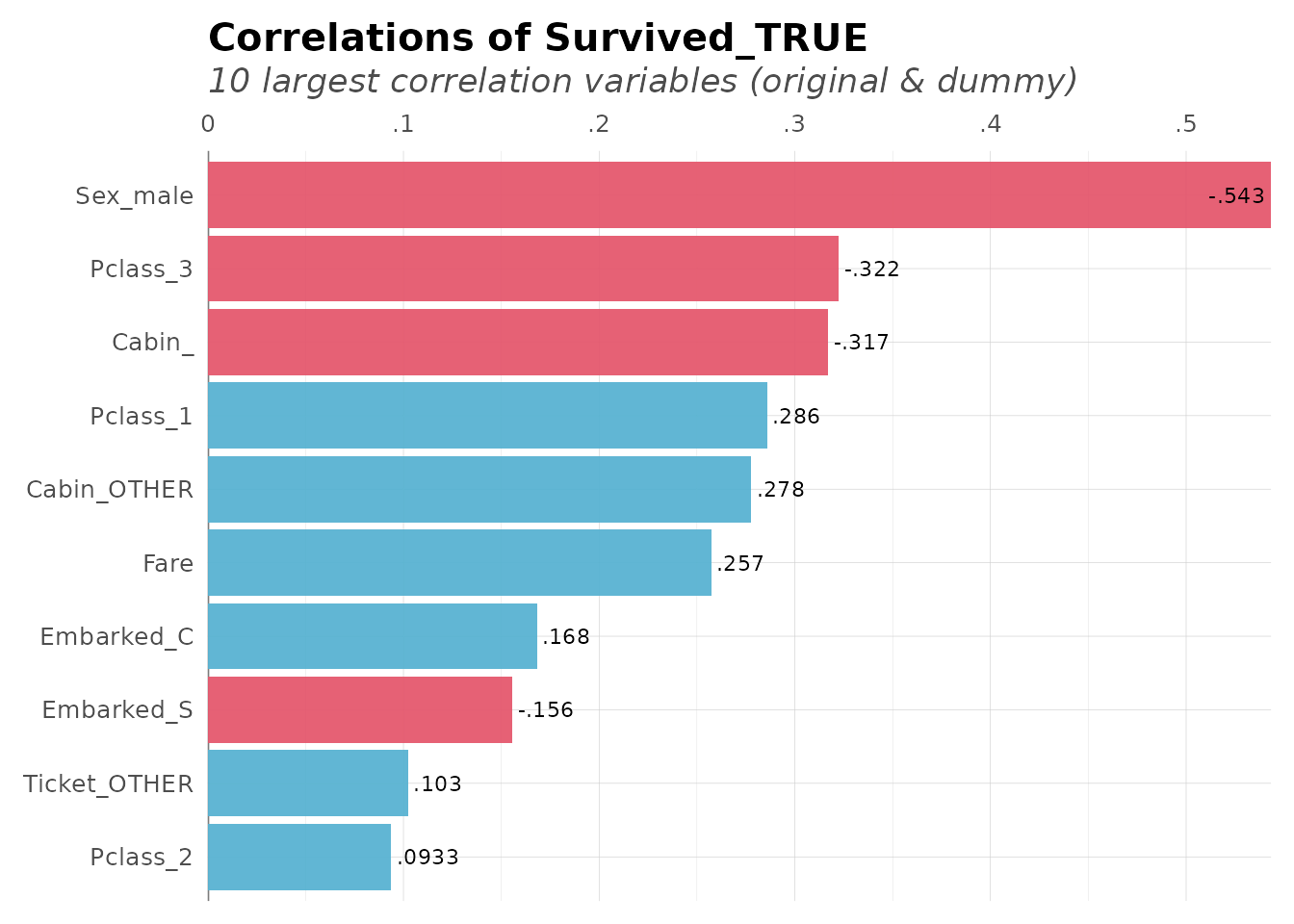
Cross-Correlations
Find the strongest correlations across the entire dataset:
# Top cross-correlations
corr_cross(dft[, 2:6], top = 8)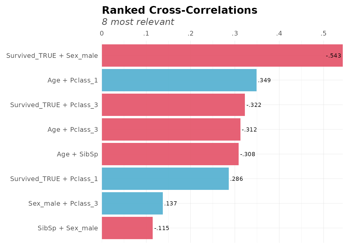
Data Transformation
Categorical Reduction
Reduce categories in high-cardinality variables:
# Reduce ticket categories (keep top 5, group rest as "other")
dft_reduced <- categ_reducer(dft, Ticket, top = 5)
freqs(dft_reduced, Ticket, top = 10)
#> # A tibble: 6 × 5
#>   Ticket       n     p order  pcum
#>   <chr>    <int> <dbl> <int> <dbl>
#> 1 other      858 96.3      1  96.3
#> 2 1601         7  0.79     2  97.1
#> 3 347082       7  0.79     3  97.9
#> 4 CA. 2343     7  0.79     4  98.7
#> 5 3101295      6  0.67     5  99.3
#> 6 347088 6 0.67 6 100.Date Manipulation
Create date features for time series analysis:
# Create sample dates
dates <- seq(as.Date("2024-01-01"), as.Date("2024-12-31"), by = "day")

# Extract year-month
ym <- year_month(dates[1:5])
ym
#> [1] "2024-01" "2024-01" "2024-01" "2024-01" "2024-01"

# Extract year-quarter
yq <- year_quarter(dates[1:5])
yq
#> [1] "2024-Q1" "2024-Q1" "2024-Q1" "2024-Q1" "2024-Q1"

# Cut dates into quarters
quarters <- date_cuts(dates[c(1, 100, 200, 300)], type = "Q")
quarters
#> [1] "Q1" "Q2" "Q3" "Q4"
Visualization with theme_lares
Custom ggplot2 Theme
lares includes a clean, professional theme:
library(ggplot2)

ggplot(dft, aes(x = Age, y = Fare * 1000, color = Survived)) +
  geom_point(alpha = 0.6) +
  labs(title = "Age vs Fare by Survival") +
  # Customize theme with several available options
  theme_lares(legend = "top", grid = "Yy", pal = 2, background = "#f2f2f2") +
  # Customize axis scales to look nicer
  scale_y_abbr()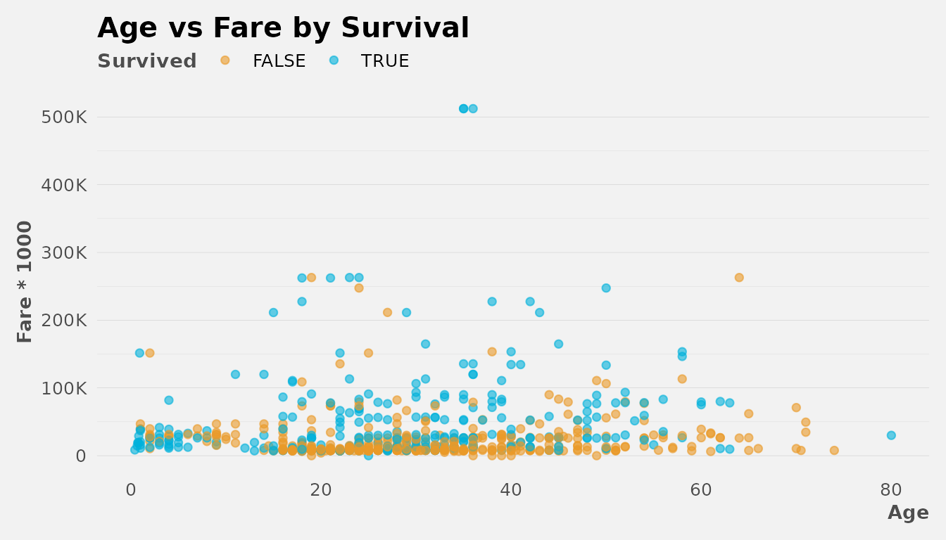
Distribution Plots
Visualize distributions quickly:
# Analyze Fare distribution
distr(dft, Fare, breaks = 20)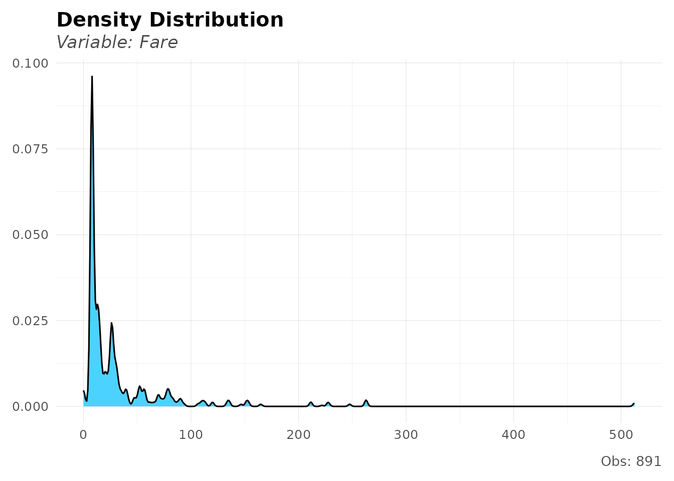
Number Formatting
Format numbers for better readability:
# Format large numbers
formatNum(c(1234567, 987654.321), decimals = 2)
#> [1] "1,234,567" "987,654.3"

# Abbreviate numbers
num_abbr(c(1500, 2500000, 1.5e9))
#> [1] "1.5K" "2.5M" "1.5B"

# Convert abbreviations back to numbers
num_abbr(c("1.5K", "2.5M", "1.5B"), numeric = TRUE)
#> [1] 1.5e+03 2.5e+06 1.5e+09
Custom Scales
Use lares scales for better axis formatting:
df_summary <- dft %>%
  group_by(Pclass) %>%
  summarize(avg_fare = mean(Fare, na.rm = TRUE), .groups = "drop")

ggplot(df_summary, aes(x = factor(Pclass), y = avg_fare)) +
  geom_col(fill = "#00B1DA") +
  labs(title = "Average Fare by Class", x = "Class", y = NULL) +
  scale_y_dollar() + # Format as currency
  theme_lares()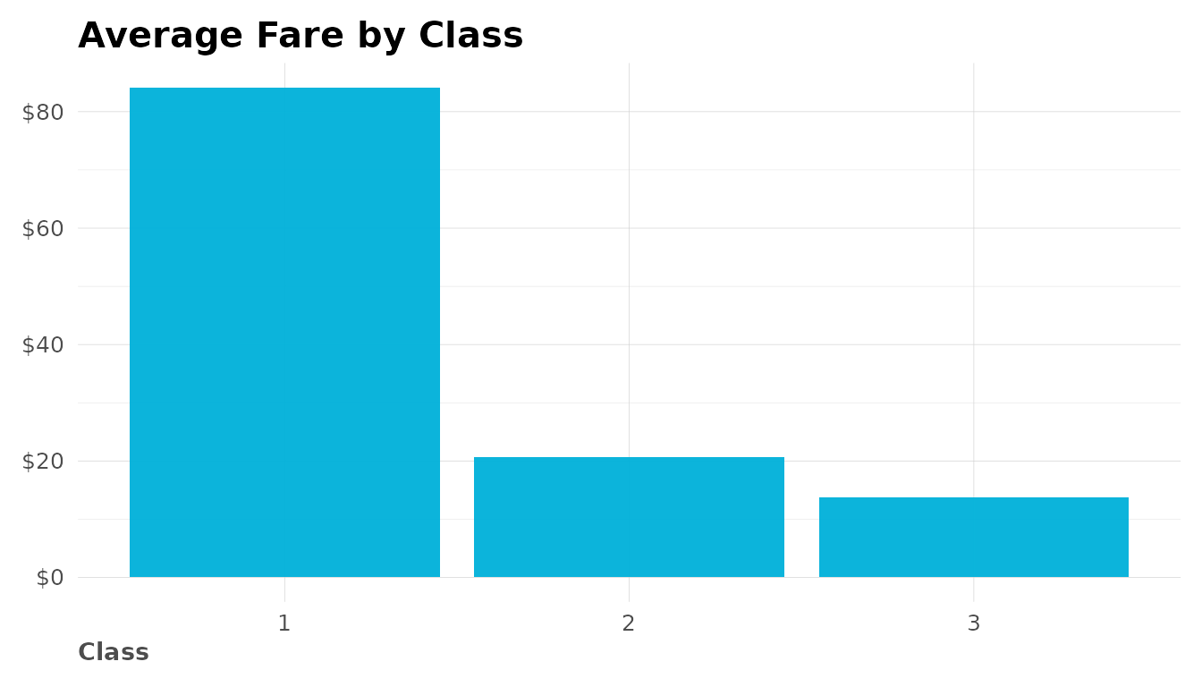
Text and Vector Utilities
Vector to Text
Convert vectors to readable text:
# Simple comma-separated
vector2text(c("apple", "banana", "cherry"))
#> [1] "'apple', 'banana', 'cherry'"

# With "and" before last item
vector2text(c("red", "green", "blue"), and = "and")
#> [1] "red, green, and blue"

# Shorter alias
v2t(LETTERS[1:5])
#> [1] "'A', 'B', 'C', 'D', 'E'"
Putting It All Together
Here’s a complete analysis workflow:
library(dplyr)

# 1. Load and prepare data
data(dft)

# 2. Clean and transform
dft_clean <- dft %>%
  mutate(Age_Group = cut(Age,
    breaks = c(0, 18, 35, 60, 100),
    labels = c("Child", "Young", "Adult", "Senior")
  ))

# 3. Analyze frequencies
freqs(dft_clean, Age_Group, Survived, plot = TRUE)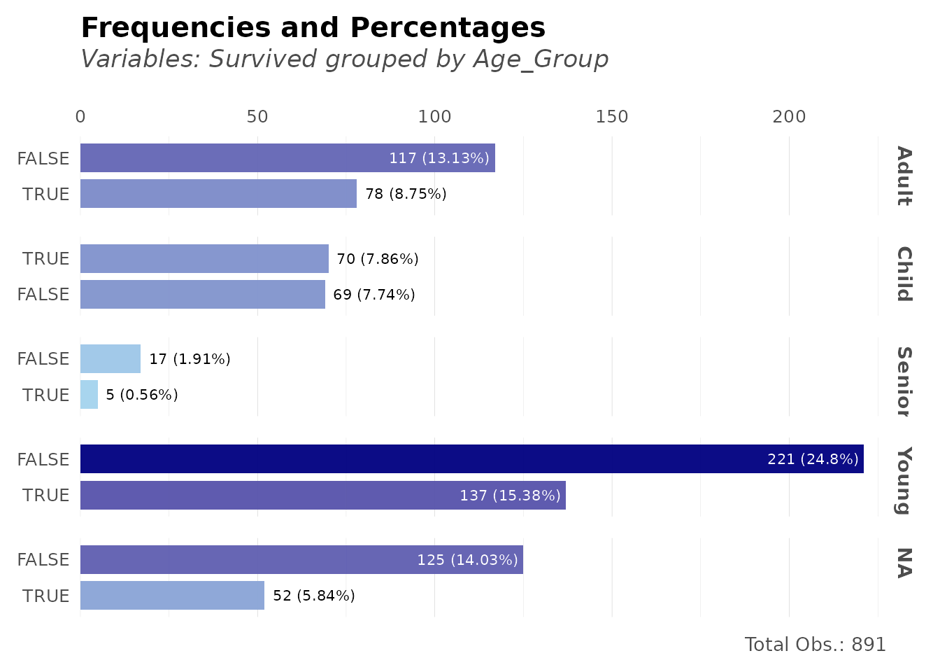
# 4. Check correlations
corr_var(dft_clean, Survived_TRUE, top = 8, max_pvalue = 0.05)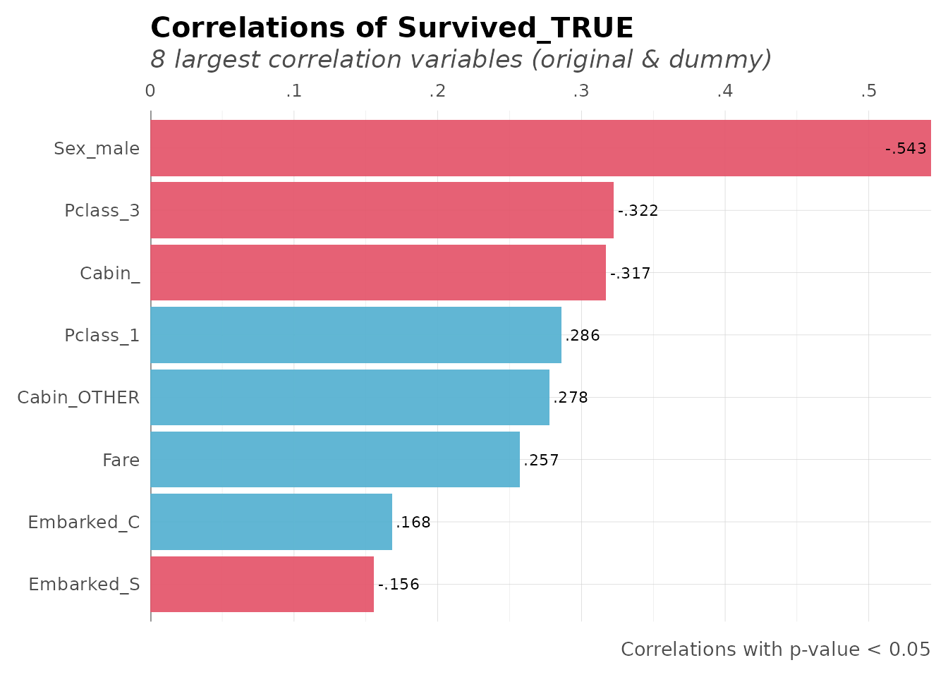
Further Reading
Package Resources
- Package documentation: https://laresbernardo.github.io/lares/
- GitHub repository: https://github.com/laresbernardo/lares
- Report issues: https://github.com/laresbernardo/lares/issues
Blog Posts & Tutorials
- Find Insights with Ranked Cross-Correlations: DataScience+
- Visualize Monthly Income Distribution and Spend Curve: DataScience+
- All lares articles: Author page on DataScience+
Next Steps
- Explore machine learning with
h2o_automl()(see Machine Learning vignette) - Learn about API integrations with ChatGPT and Gemini (see API Integrations vignette)
- Check individual function documentation:
?freqs,?corr,?theme_lares